
Challenge
Drata's original compliance dashboard wasn't meeting the needs of our Compliance Manager persona. Key information was either buried or absent, making it difficult for users to quickly understand their organization's security and compliance posture. Worse, some of the data presented could be misleading—creating confusion and risking a loss of trust in the platform. This was a missed opportunity to deliver immediate, actionable insight in a space where clarity and accuracy are critical.
North star vision — the direction we aligned on before diving into solutions
Solution
To support the dashboard redesign, I updated and extended our design system — introducing new components, refining visual styles, and ensuring consistency across layouts. These system-level changes not only improved the dashboard experience but also gave our team reusable building blocks that sped up future feature development.
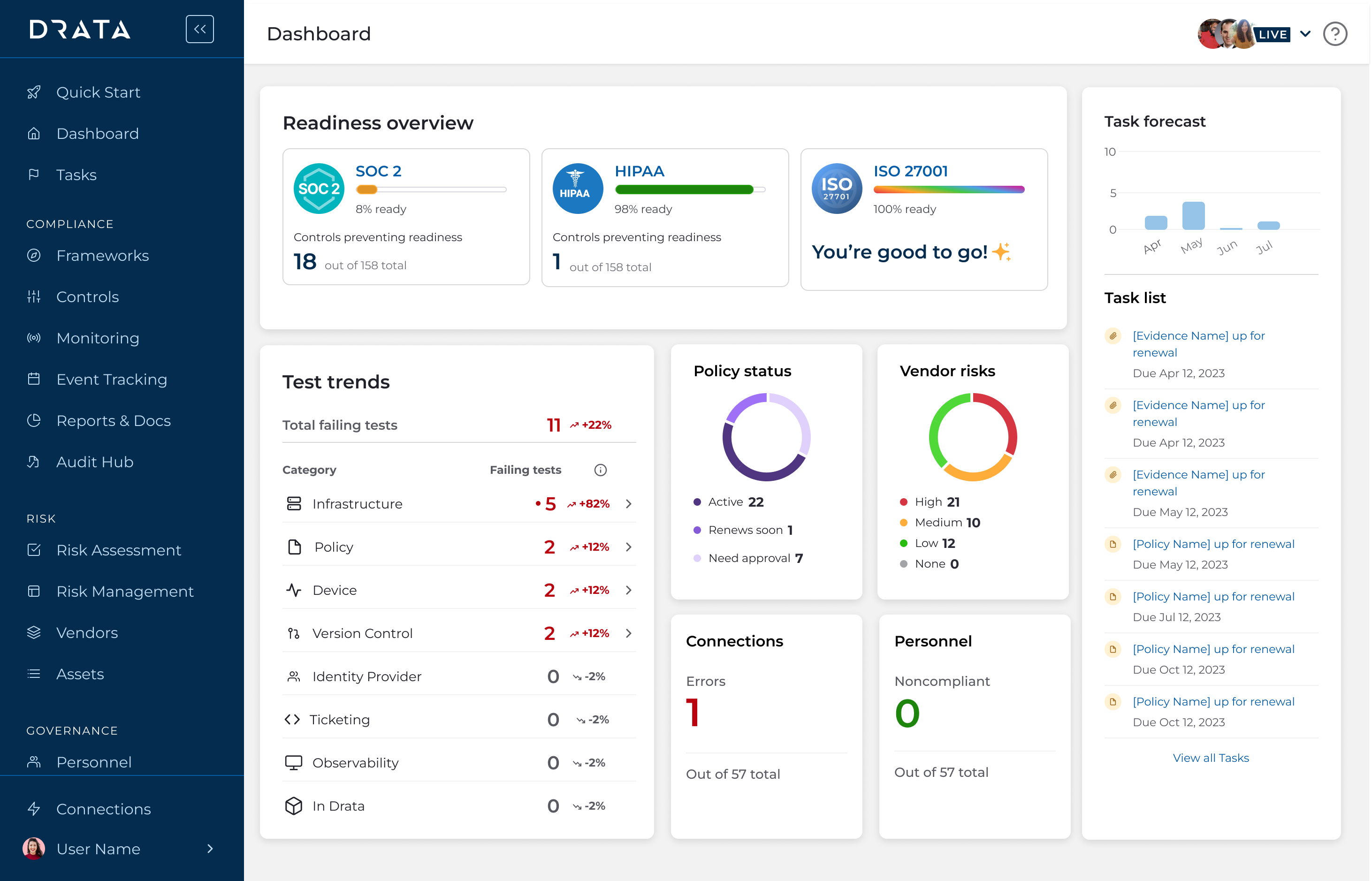
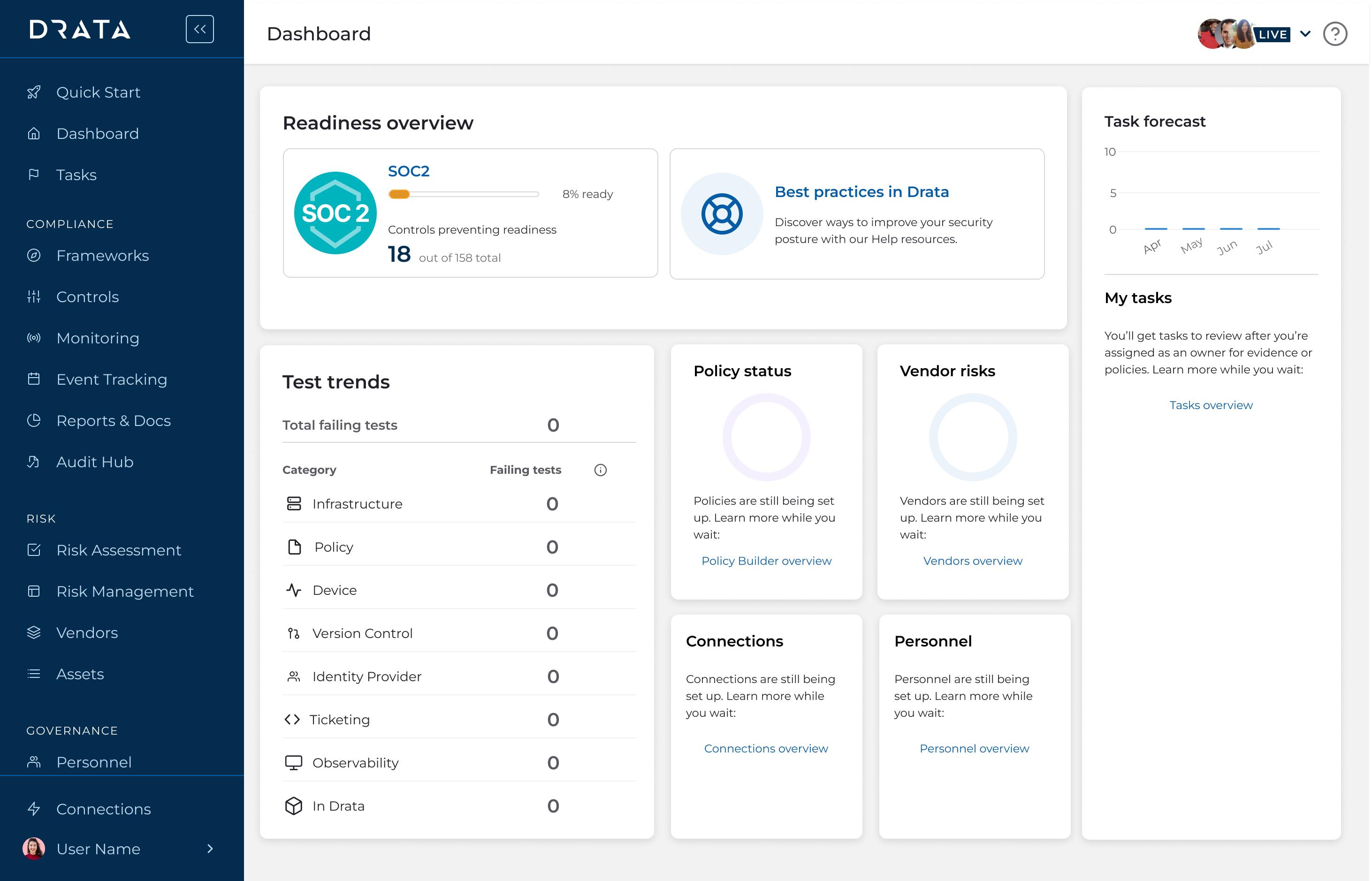
Readiness overview
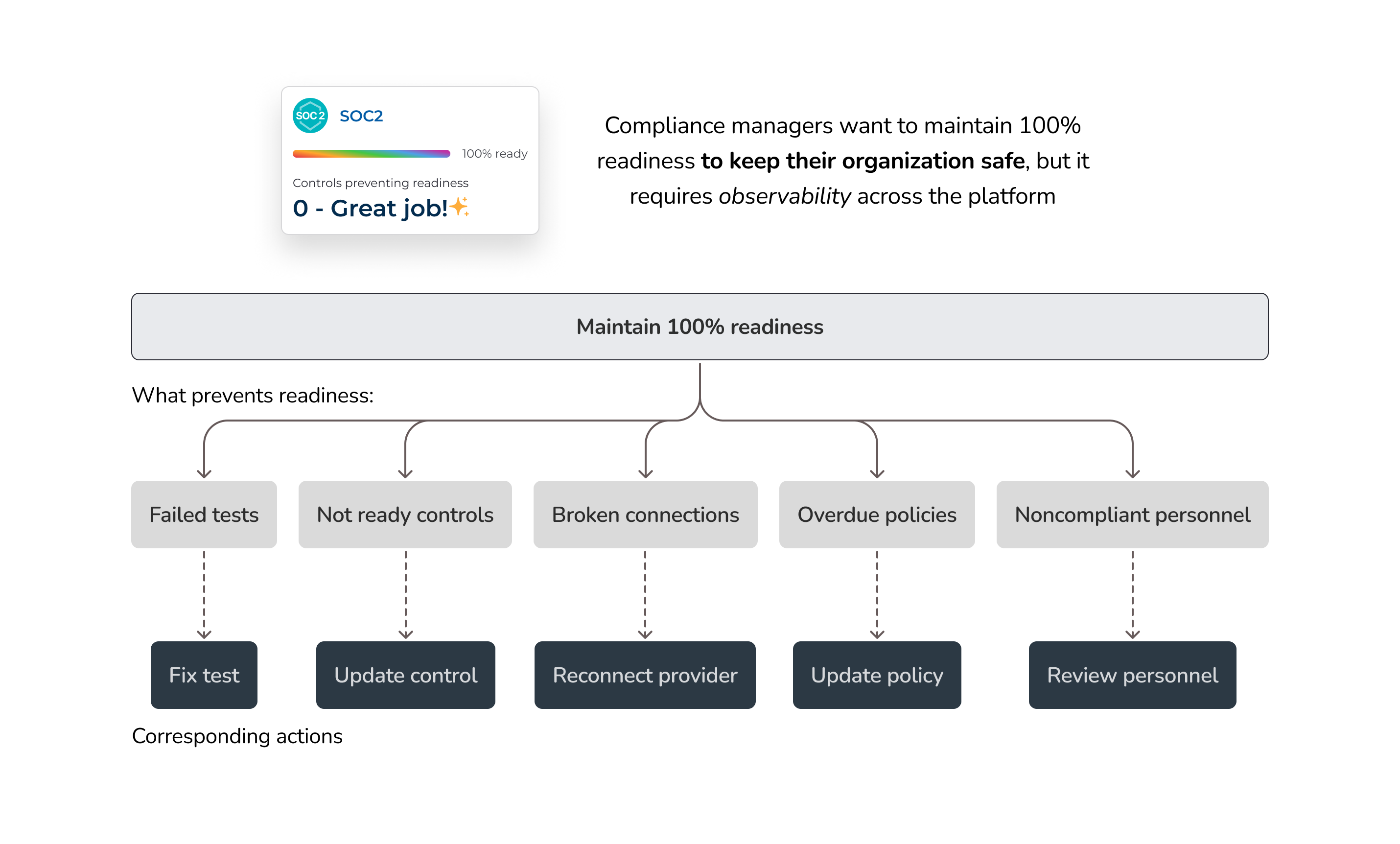
A dedicated section showing real-time progress across compliance frameworks (e.g., SOC 2, HIPAA, ISO 27001). Users can drill down directly into problem areas, with reduced clicks, making it faster to identify and resolve issues that impact audit readiness.
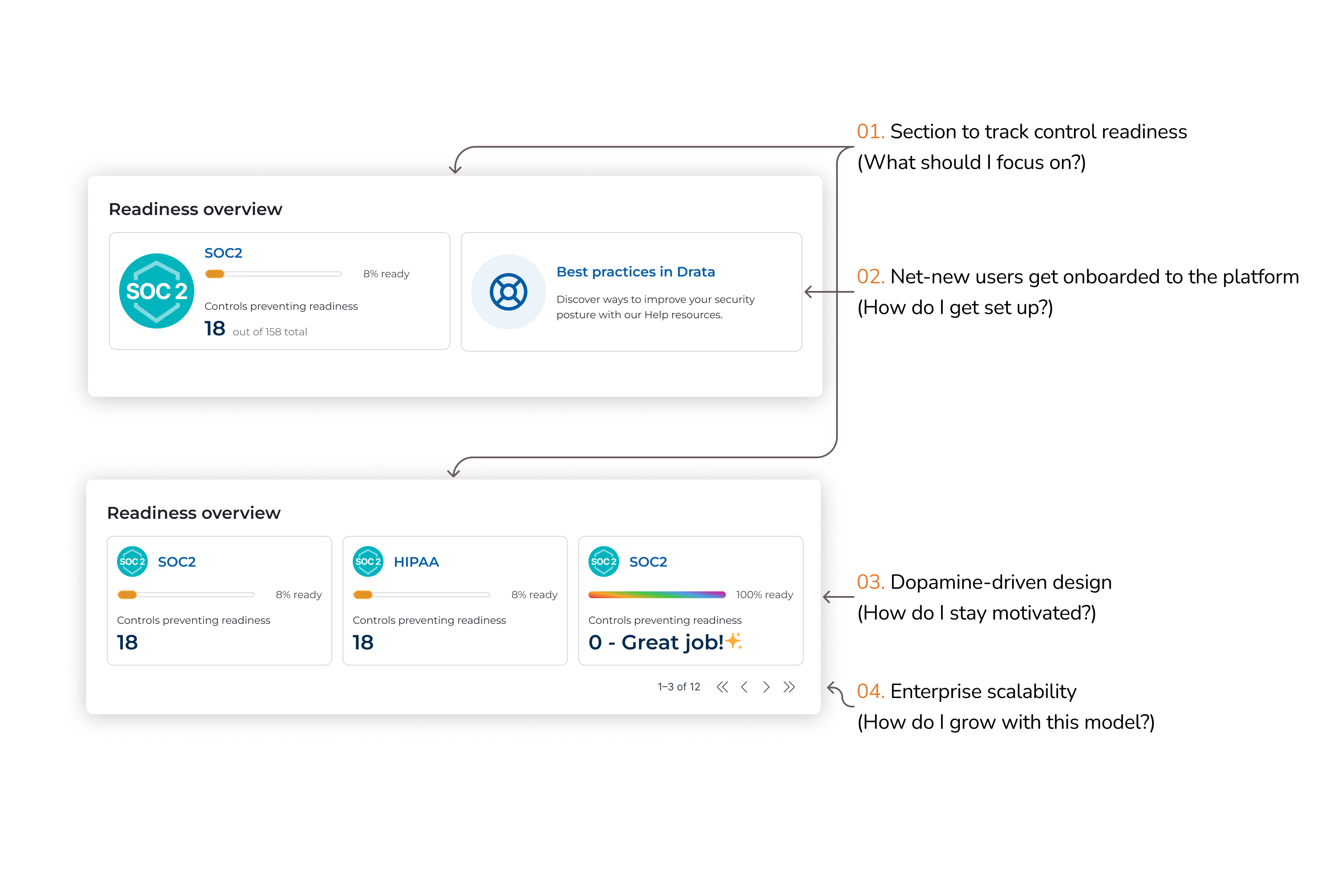
Readiness overview: create a focus on framework progress
Test trends
Visualizes current and historical test failures, helping users spot new issues quickly and prioritize them accordingly. Clicking into a failing test category takes users straight to the test details, streamlining remediation and reinforcing a tactical, fix-first workflow.
Test trends: provide a visualization of current and historical test failures
Task forecast
Surfaces upcoming tasks directly on the dashboard, helping Compliance Managers anticipate what's next without having to dig. This forward-looking view reduces navigation friction and supports proactive compliance operations.
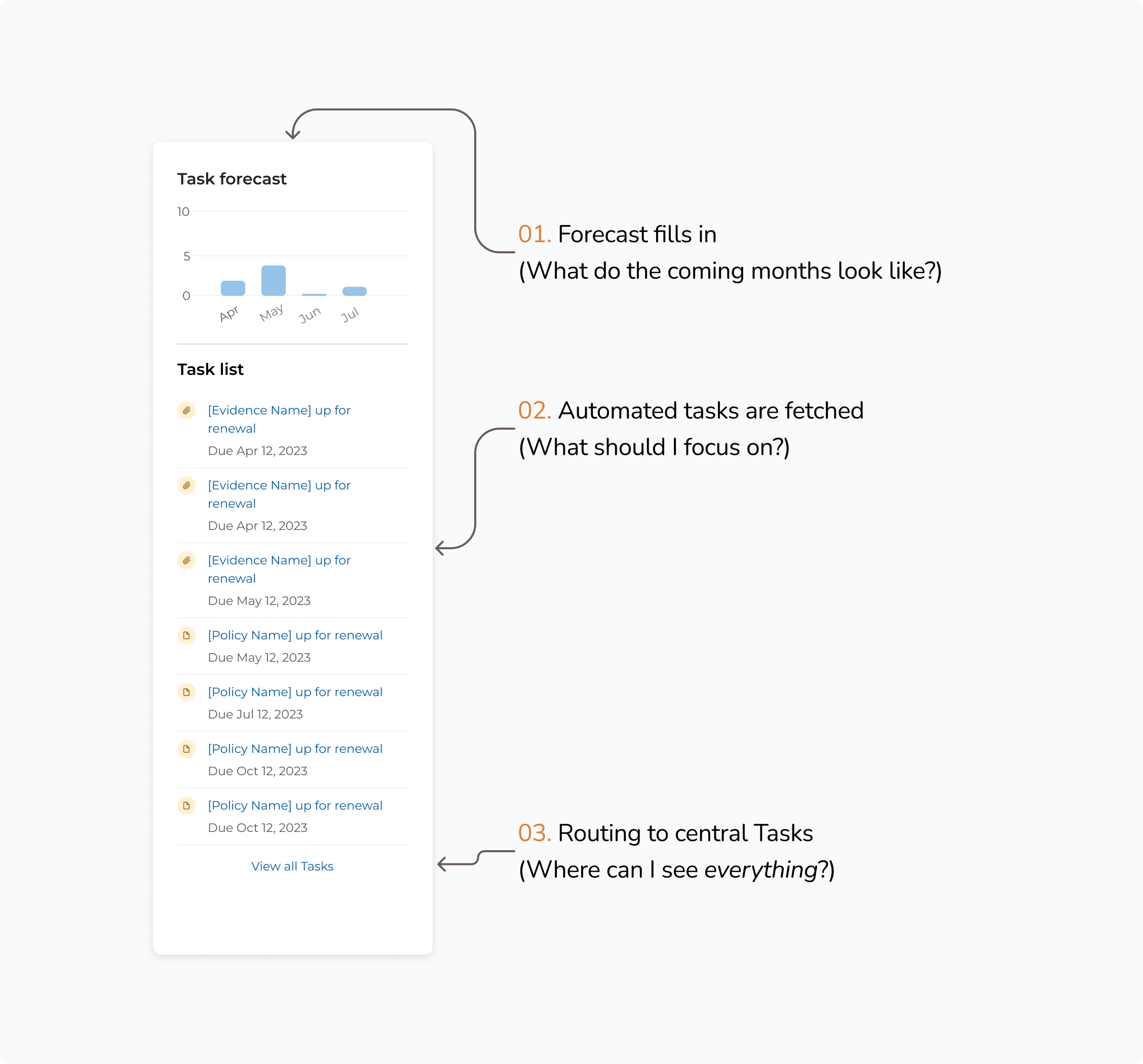
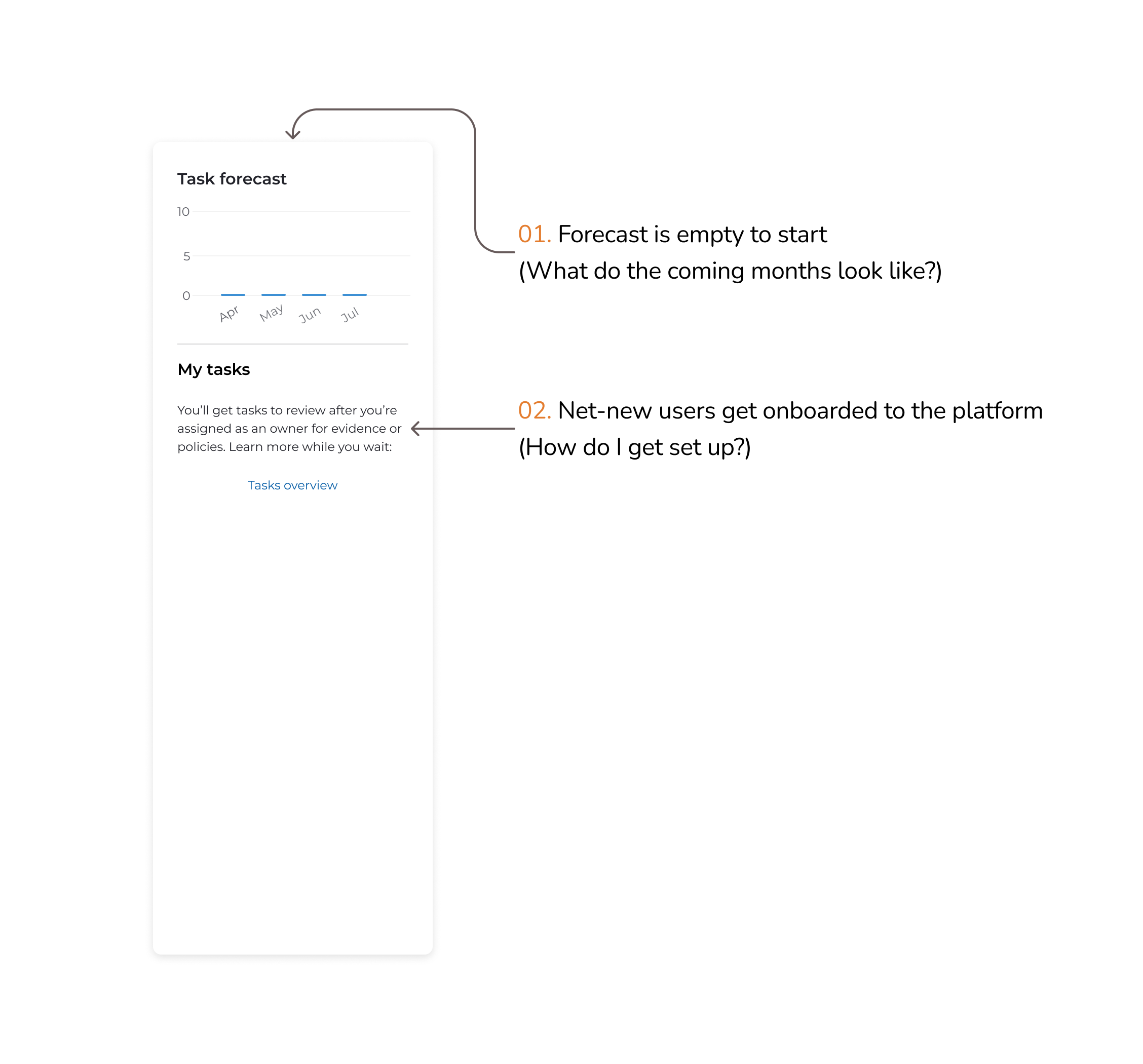
Task forecast: indicate upcoming tasks and priorities
Stat widgets
Quick-glance metrics for essential compliance categories—like policy status, vendor risk, personnel compliance, and system connections. Each widget links directly to the relevant section, enabling users to resolve issues with minimal friction.
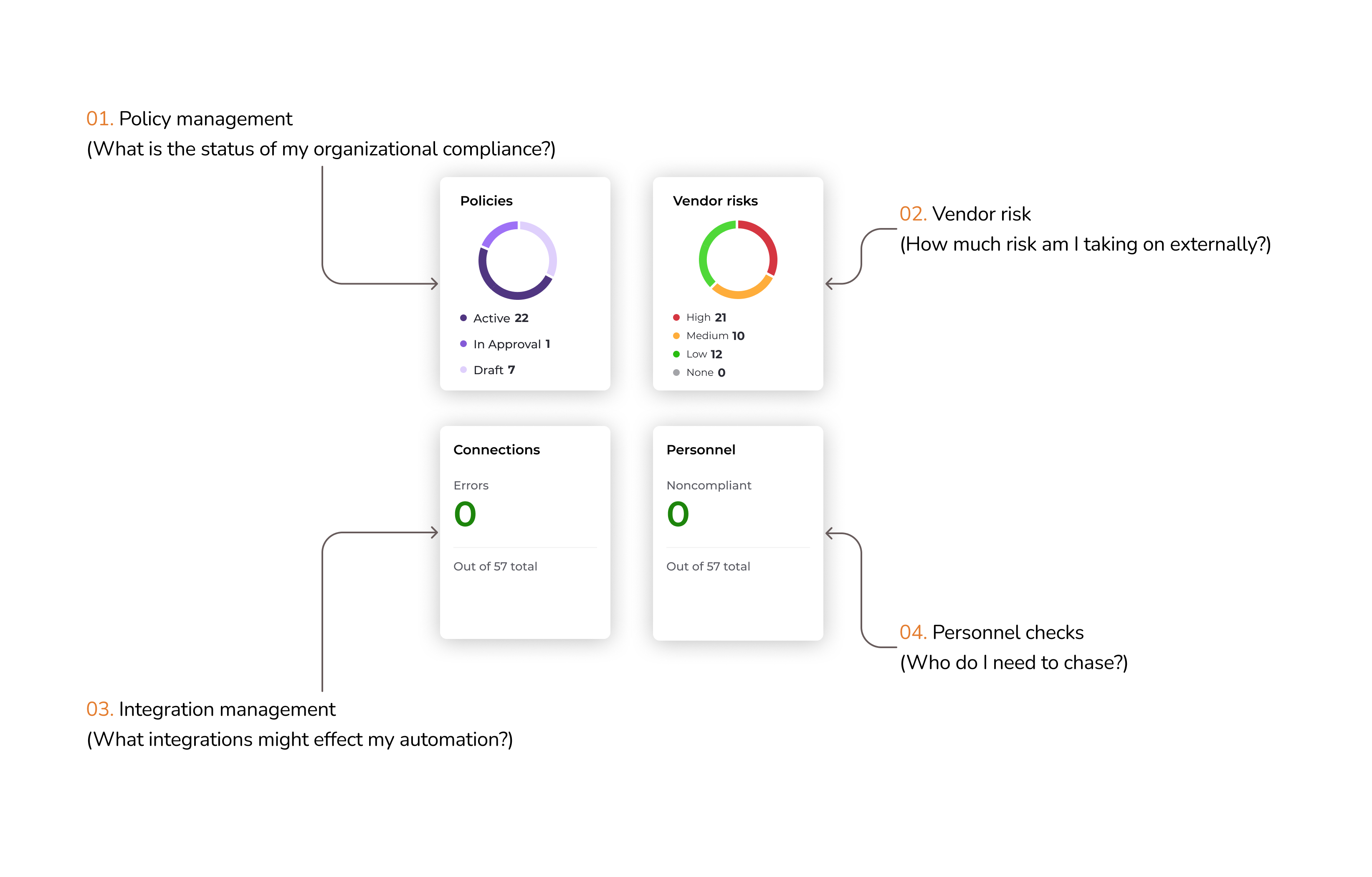
Stat widgets: show quick compliance metrics
Impact
The redesigned compliance dashboard made it easier for customers to prioritize their work and troubleshoot key problems, a shift that was consistently highlighted in customer feedback. Adoption increased significantly, with usage climbing by 200%, and the experience earned an 8.8 NPS in follow-up surveys — clear signals that the updates delivered real value.
0%
Increase in dashboard usage
0.0
NPS score in follow-up surveys
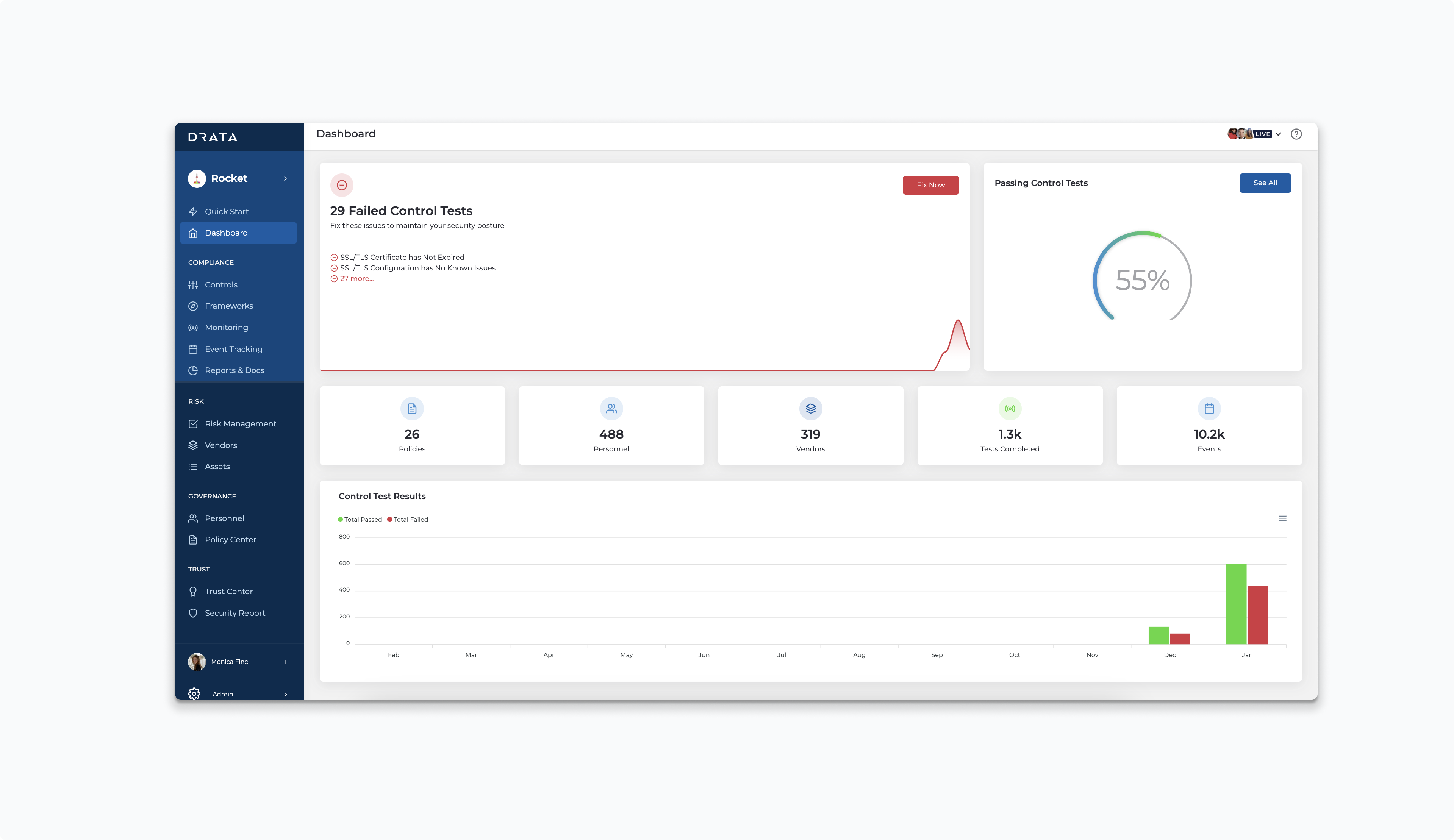
The final high fidelity dashboard
Discovery
I kicked off the project with a structured discovery phase, dedicating two full sprints to research and exploration. During this time, I led the process end-to-end, while keeping my PM and EM closely involved to ensure alignment and shared understanding. This upfront investment helped us define the right problems and set a clear direction for design.
Review existing research
I started by reviewing existing research across Gong, Slack, and internal documentation to understand what wasn't working with the existing dashboard. While Drata hadn't consistently grounded projects in user problems before, I wanted to ensure we were solving the right one. Through this investigation, I aligned with leadership on a shared definition: a dashboard should highlight what needs attention and make it easy to act. For our Compliance Manager persona—especially in SMB and Mid-Market segments—the primary goal is maintaining audit readiness.
We needed an operational dashboard — one that immediately flags issues and enables fast resolution.
Audit existing dashboard
I audited Drata's current dashboard to evaluate how well it met the core user need: "show me what I need to fix." What I found was a largely non-operational experience. Aside from prompting users to fix integrations, most of the content duplicated navigation elements or surfaced low-value metrics—offering little actionable insight for compliance managers.
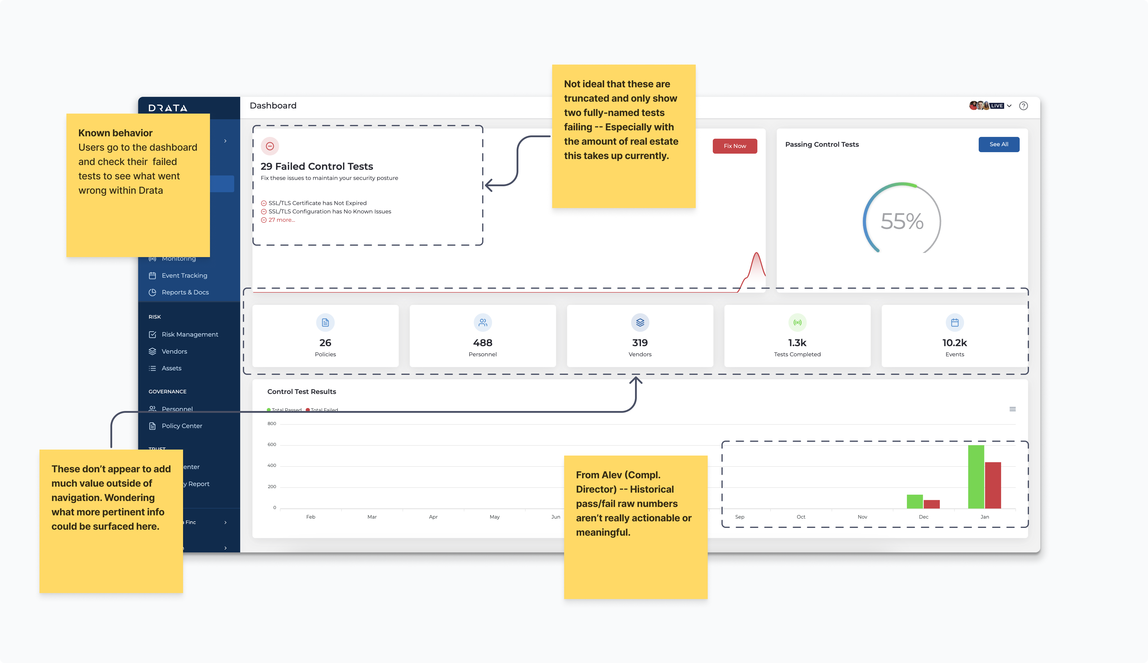
Screenshot of former dashboard with annotations
Usability testing
Following contextual inquiry, I designed and tested multiple dashboard iterations focused on key user jobs:
- Seeing audit readiness by framework
- Identifying which tests need fixing
- Prioritizing upcoming tasks
- Understanding the overall state of their compliance program
Each version was reviewed with engineers, internal users, and leadership to ensure alignment and effectiveness.
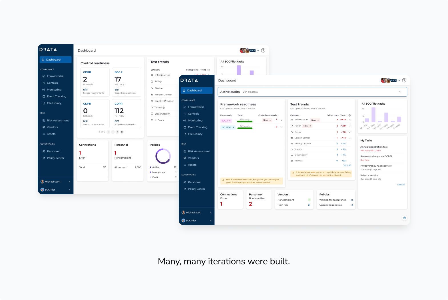
Usability testing - Mid-fidelity prototypes
Key takeaways
- Compliance work is largely tactical—managing and preventing failures.
- Cumulative failures lack context and aren't helpful for assessing progress.
- Users need to understand why something changed to take meaningful action.
- Prioritized, grouped data enables more efficient workflows.
- Drata is often used reactively, triggered by email or Slack notifications.
Reflections
One of the most meaningful parts of this project was making the redesigned dashboard fully responsive — something Drata's product hadn't consistently prioritized before. As I worked through the layouts, it became clear how often compliance managers were checking in on their programs from mobile devices: grabbing a quick status update between meetings, reviewing audit readiness before a call, or reacting to a Slack notification on the go. Building responsiveness in from the start, rather than retrofitting it as an afterthought, fundamentally changed the design decisions I made throughout.
That shift ended up being a catalyst for something larger. This project became one of the first at Drata to treat mobile as a first-class experience, and it opened up conversations across the team about what a more consistent, mobile-first design language could look like at the product level.